


Find out about all the possibilities for your brand
Leave your contact and we will contact you within one business day
By clicking on button, you agree to our Terms and Conditions and our Privacy Policy
Kristina Blømquist
Visual Identity and Platform for an Alternative Nordic Fashion Brand
Year: 2025
Scope of Work: brand platform, visual identity, logo design, brand guidelines
Challenge: For Kristina Blømquist, we developed a visual identity that translates the brand’s distinctive approach to fashion into a coherent visual system. The project covered the development of the identity concept, logo, typography, colour palette, graphic patterns, key visuals, stationery, and a broader set of visual references for retail and physical environments.
Kristina Blømquist is a Copenhagen-based fashion brand founded around the intersection of fashion, art, architecture and research. Rather than following established conventions, the brand explores clothing as a form of self-expression, and as a response to the world around us. The challenge was to create an identity capable of holding these contradictions together: beauty and collapse, darkness and light, functionality and artistic expression.
Scope of Work: brand platform, visual identity, logo design, brand guidelines
Challenge: For Kristina Blømquist, we developed a visual identity that translates the brand’s distinctive approach to fashion into a coherent visual system. The project covered the development of the identity concept, logo, typography, colour palette, graphic patterns, key visuals, stationery, and a broader set of visual references for retail and physical environments.
Kristina Blømquist is a Copenhagen-based fashion brand founded around the intersection of fashion, art, architecture and research. Rather than following established conventions, the brand explores clothing as a form of self-expression, and as a response to the world around us. The challenge was to create an identity capable of holding these contradictions together: beauty and collapse, darkness and light, functionality and artistic expression.
Visual Identity and Platform for a Nordic Avant Apocalypse Fashion Brand

building a visual language for a world in transition
the world is fucked
we stitch the ruins into style
Kristina Blømquist is a small brand with big ambition. Brand’s philosophy is deliberately opposed to imitation and conventional fashion logic: We don’t imitate. We create. The brand rejects fast fashion and mass production, focusing instead on carefully designed garments, sustainable materials and innovative approaches to production. Its visual identity therefore needed to communicate ambition without becoming decorative, and individuality without losing functionality.
Kristina Blømquist insists on facing the hard questions of our time - raised in the shadow of global pandemics claiming millions of innocent lives, a collapsing world order, global warming dismissed with negligence, the largest war in Europe since the Second World War, and dictatorial or populist regimes gaining ground across the globe, while riots expose deep-rooted social injustices.
Kristina Blømquist insists on facing the hard questions of our time - raised in the shadow of global pandemics claiming millions of innocent lives, a collapsing world order, global warming dismissed with negligence, the largest war in Europe since the Second World War, and dictatorial or populist regimes gaining ground across the globe, while riots expose deep-rooted social injustices.

pandemics. war. collapse. injustice
mass production destroys, sustainability costs
we choose the harder path
mass production destroys, sustainability costs
we choose the harder path
brand’s raison d'être
Kristina Blømquist creates stylish, functional fashion, producing clothing from high-quality, sustainable materials
Kristina Blømquist creates stylish, functional fashion, producing clothing from high-quality, sustainable materials

welcome to the lovely nightmare
welcome to
welcome to

from philosophy to visual identity
The identity combines a restrained contemporary typographic language with a strong symbolic logomark. Geometric forms meet organic references; darkness meets light; minimalism meets expressive graphics. This creates a system that can remain highly controlled when necessary, while still carrying the unconventional character of the brand. The result is not a single static logo, but a flexible identity designed to work across communication, packaging, digital applications, stationery and physical brand environments.

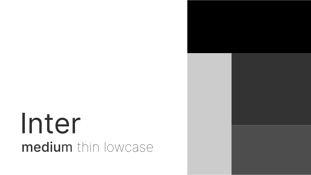


identity in lowercase
The wordmark is deliberately set in lowercase. This decision reinforces the brand’s rejection of conventional fashion codes while introducing a sense of simplicity, humility and contemporary clarity. The restrained typography creates a calm counterpoint to the symbolic intensity of the Black Sun. The combination gives the identity its particular rhythm: quiet typography, strong symbolism. Rather than competing for attention, the wordmark establishes a recognizable voice that allows the rest of the identity system to evolve around it.

rise of the black sun
The central graphic element of the identity is the Black Sun. The symbol is constructed from two intersecting circles, creating an image reminiscent of a solar eclipse - a rare moment in which light and darkness meet. It represents both an ending and a beginning, becoming a visual metaphor for the transition between eras.


The Black Sun can function independently from the wordmark, allowing it to become a recognisable signature across different applications. More than a graphic device, it distils the brand’s worldview: duality, transformation and the possibility of creating something new within uncertainty.


organic traces of pattern
One of the supporting graphic elements draws from the silhouette of bare tree branches. The pattern introduces an organic, almost skeletal structure into the otherwise controlled identity. It connects the visual language with the brand’s relationship to nature while also evoking fragility, transformation and the environmental challenges embedded in its philosophy.

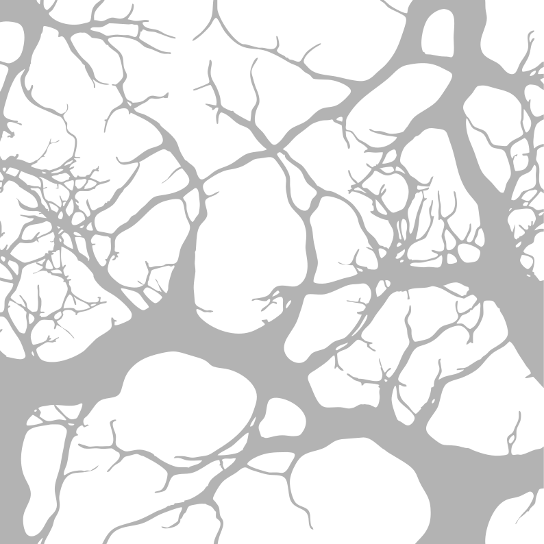


no fast fashion
no mass production
survival in organic cotton, steel, & concrete
no mass production
survival in organic cotton, steel, & concrete
from identity to experience
visual identity as a system
The visual identity was developed as a system rather than a collection of isolated assets. The same principles extend into key visuals, stationery, patterns, textures and spatial applications, creating continuity between communication and the physical brand environment. The identity can adapt to different scales: from a small label to a larger retail environment.
This flexibility is particularly important for a fashion brand whose identity exists not only through communication, but through garments, materials, spaces and physical experiences.
This flexibility is particularly important for a fashion brand whose identity exists not only through communication, but through garments, materials, spaces and physical experiences.


navigation system
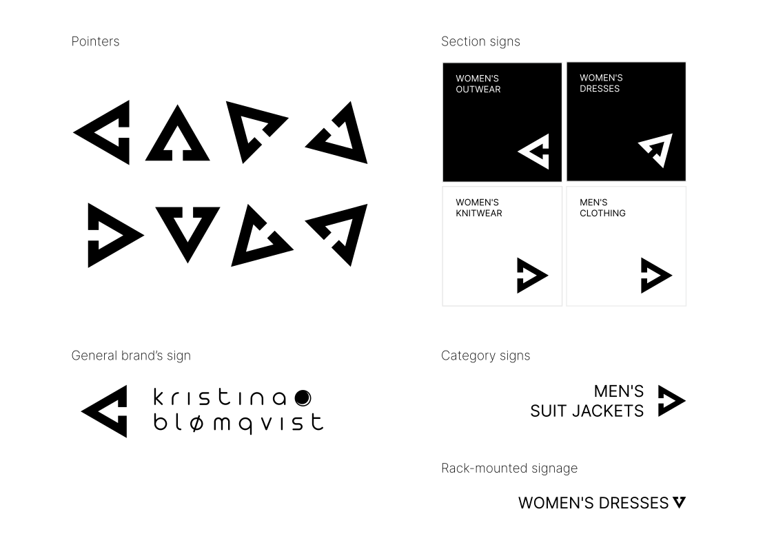
The store navigation system translates the visual identity into a clear and functional wayfinding language. Built around simple geometric forms, brand typography and a restrained monochrome palette, the system creates distinct visual markers for different product areas.
Directional symbols derived from the identity guide customers through the space, while the modular composition of the signs allows the system to adapt to different locations and scales. The result is an intuitive navigation experience that makes it easier to find each product category without adding unnecessary visual complexity.
Minimal in form, functional in purpose, and fully integrated into the brand identity.
Directional symbols derived from the identity guide customers through the space, while the modular composition of the signs allows the system to adapt to different locations and scales. The result is an intuitive navigation experience that makes it easier to find each product category without adding unnecessary visual complexity.
Minimal in form, functional in purpose, and fully integrated into the brand identity.



contrast as base
The identity is designed around controlled contrasts: geometric / organic, dark / light minimal / expressive, function / fashion, technology / nature. These oppositions allow the system to move between different levels of expression while maintaining a consistent visual character.
The restrained core (wordmark, typography and basic geometry) provides structure. Graphic elements, patterns and textures introduce atmosphere, materiality and a sense of imperfection
The restrained core (wordmark, typography and basic geometry) provides structure. Graphic elements, patterns and textures introduce atmosphere, materiality and a sense of imperfection

clothing as armor
identity as a weapon
beauty in collapse
identity as a weapon
beauty in collapse
сlothing as armour
identity as a weapon
beauty in collapse
At the centre of the brand is the idea of Avant Apocalypse Fashion imagined against the backdrop of an unstable and uncertain world.
Rather than ignoring global crises, environmental pressure and social instability, the brand turns them into part of its creative language. Fashion becomes both fantasy and reality, art and function, protection and self-expression. This tension became the foundation for the visual identity.
Rather than ignoring global crises, environmental pressure and social instability, the brand turns them into part of its creative language. Fashion becomes both fantasy and reality, art and function, protection and self-expression. This tension became the foundation for the visual identity.

when darkness becomes a starting point for creation
Kristina Blømquist uses fashion to explore the relationship between creativity, functionality and an increasingly uncertain world
We translated this position into an identity that is deliberately restrained yet uncompromising: a lowercase wordmark, a powerful symbolic mark, organic graphic elements and a system built on contrast.
The result is a flexible identity system designed to make the brand immediately recognisable while supporting a clear, intuitive retail experience: from communication and stationery to navigation, spatial graphics and future brand applications.
The result is a flexible identity system designed to make the brand immediately recognisable while supporting a clear, intuitive retail experience: from communication and stationery to navigation, spatial graphics and future brand applications.
Created in 2025
Project development period: 2 months
Project team:
Personal Account Manager of the project, Brand Designer, Art Director
Technology:
Methodology, Design thinking, Brand design, Branding, Logo design, Retail design
Project development period: 2 months
Project team:
Personal Account Manager of the project, Brand Designer, Art Director
Technology:
Methodology, Design thinking, Brand design, Branding, Logo design, Retail design


